This website uses cookies so that we can provide you with the best user experience possible. Cookie information is stored in your browser and performs functions such as recognising you when you return to our website and helping our team to understand which sections of the website you find most interesting and useful.
Price discrepancies in the world of digital assets

What a strange market!
We at SUN ZU Lab are striving to gain a deep understanding of how the markets for digital assets function, to help our clients achieve their investment strategy through better execution. Based on our long (very long!) experience of traditional markets, we have started looking closely at liquidity and arbitrage. The interested reader will find a sample of our efforts here.
We subsequently turned our attention to the basic behavior of trading venues, trying to understand if there was something special there compared to what we knew of traditional well-established exchanges. Thus we started looking at small-scale data to try and detect unusual patterns. Because we aimed at being as systematic and unbiased as possible, we devised automated filters to isolate those events.
The result is our latest weekly “market anomalies” report, which presents events selected because of a sharp price movement or heavy volume. For each of those events, we look at price discrepancies and/or volume patterns. Well, the results are quite surprising, here are three examples abstracted from our report dated March 26th for bitcoin.
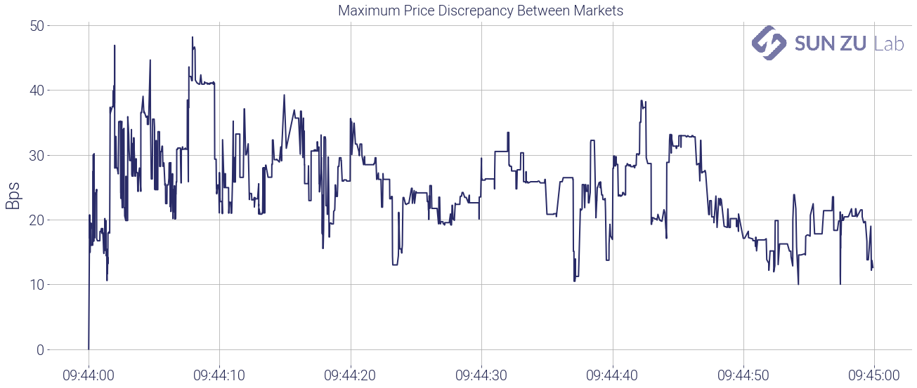
Price anomaly #1: -1.53% on 3/21/21 between 09:43 and 09:44 UTC
By looking at the most significant price movements over a 1-minute interval we can detect periods where markets are moving “fast”, and those moments are very good candidates to detect unusual price or volume patterns.
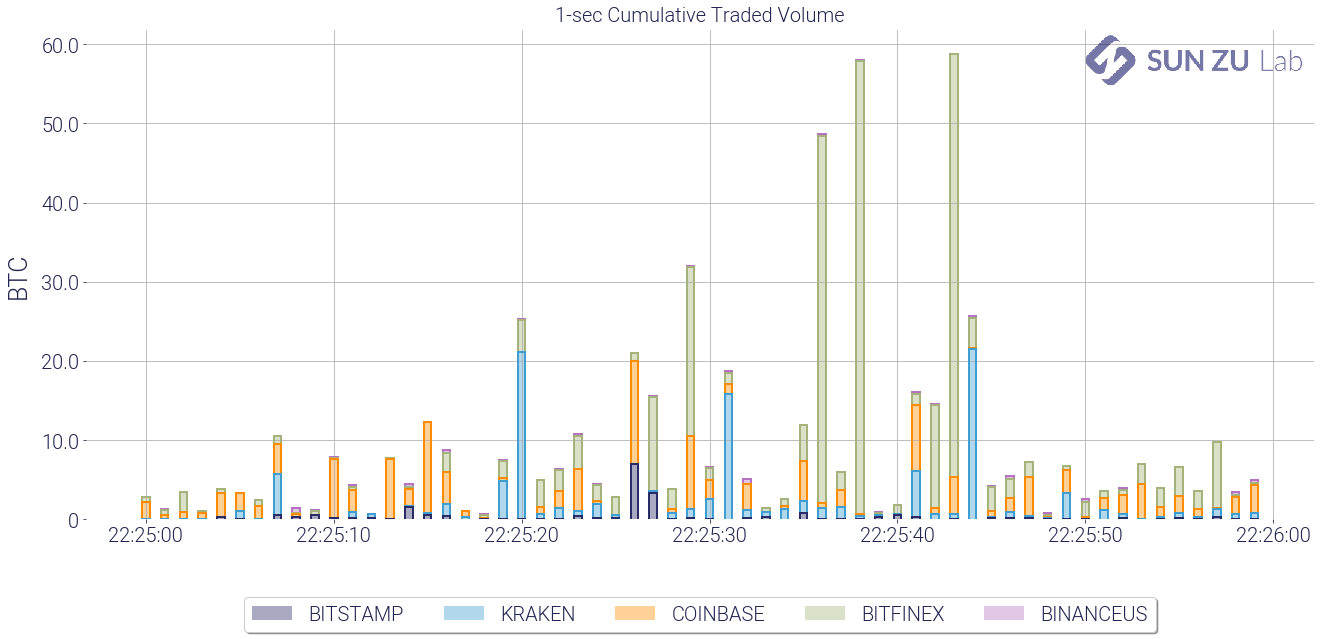
As an illustration, below is the 1-minute charts of BTC prices and volumes on 5 venues, between 9:43 and 9:44 on 3/21:


To get a better sense of price discrepancies, we chart the maximum price difference in the interval between the lower and higher price:
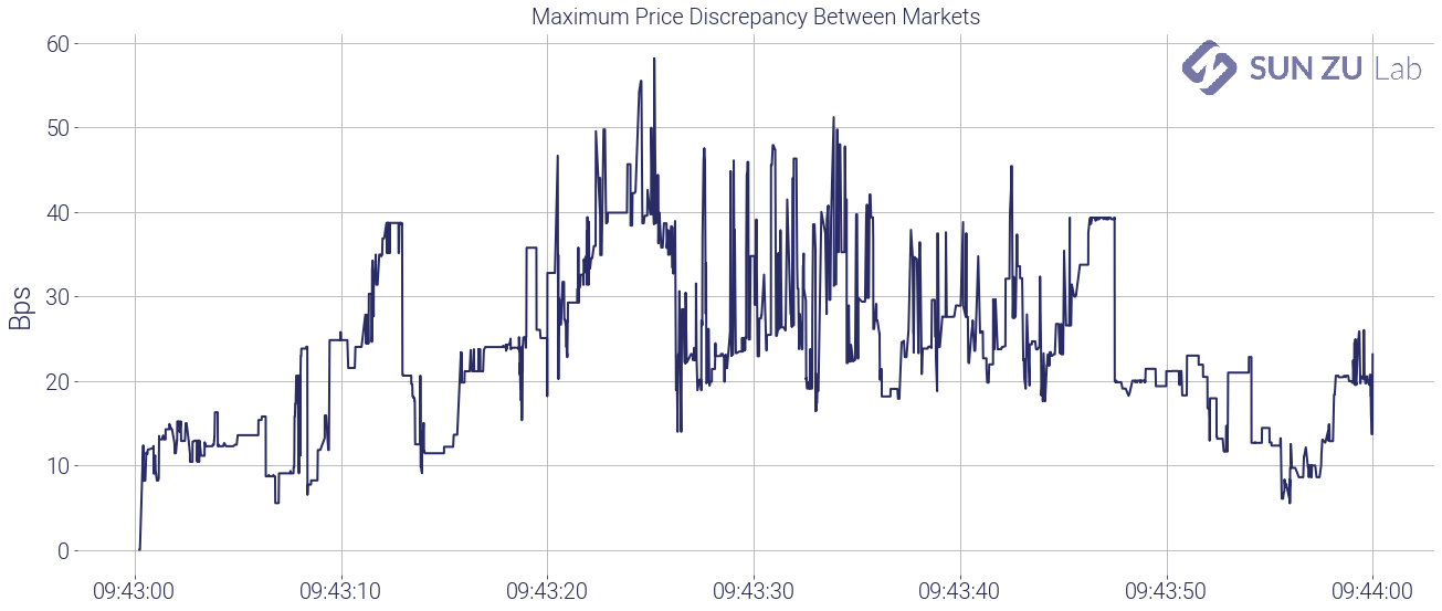
It is fairly clear that during this period, prices on the different venues were far from being “aligned”. In another of our reports, we look at price discrepancies and arbitrage opportunities at a macro scale, but here at the tick level, we suspect there are opportunities to be grabbed.
Or are there? Let’s have a closer look at the strangeness of this picture:
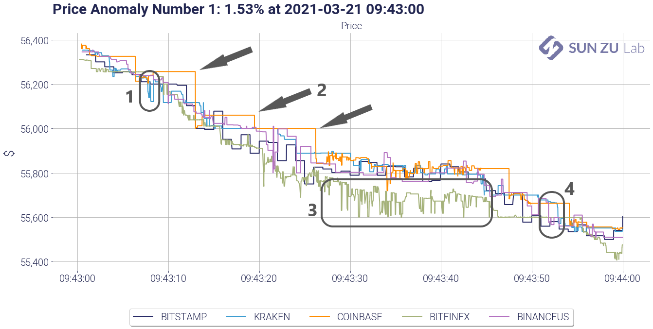
I have numbered 4 surprising patterns:
- a small blip of Kraken vs. other exchanges: what is happening on Kraken at that precise time? BTC is trading there several times $100 below other markets. What is unexpected is not the fact that one venue experiences sharp movements independently from the others. The surprising part is that none of the other venues moves in sync. We strongly suspect that there are many arbitragers out there sharpening their trading algorithms to specifically identify and exploit those situations. Why was there no change anywhere but on Kraken? One possible explanation is that there was not enough time to capture that opportunity. Well, this is unlikely because as it happens all venues traded repeatedly during a window that lasted several seconds. Another explanation is that bid/ask spreads were very wide and trades occurring on one side of the spread appeared to be out of sync. Investigating that idea requires tick-by-tick order book data, and a little bit of work (but do not worry we are on it). Another explanation could be that some of the trades on Kraken were fake trades, or that they happened outside the regular bid/ask spread if they were “pre-negotiated” (a particular status that indicates a block trade on traditional exchanges). In any case, we would need a little bit more information from the exchange to be able to conclude.
- Coinbase price seems to be lagging: as surprising as it looks, this type of pattern is quite straightforward to explain. It results from the lag in order book positioning on Coinbase. The bid/ask spreads on other exchanges adapts more rapidly, which means that prices tend to lag and adjust at the last moment (i.e. the next transaction) on Coinbase. Again confirming this initial intuition requires tick-by-tick order book data, but nothing worrying there.
- Bitfinex at $100 to $150 discount compared to other markets: well, that’s a big one. The discount on Bitfinex appears 20 seconds before but stays stubbornly high. It appears and doesn’t disappear for some time (see #2 anomaly below where it exists with the same magnitude). A discount like this would rarely appear on traditional markets (stocks, derivatives, bonds, etc) because market participants would arbitrage it away sooner rather than later. If it persists as it does here, it is not your typical liquidity discount. Indeed, it is associated with Bitfinex, other exchanges keep trading in sync (more or less). Therefore the underlying reason is to be found with the specifics of Bitfinex: are there trading constraints that would induce investors to severely discount BTC on that platform compared to another? Indeed our research confirms that this discount appears quite regularly, and never turns into a premium. Investors should therefore be mindful and investigate further the underlying reasons that could create a recurring anomaly like this (as will we!).
- $80 price difference between Kraken on one side and Bitstamp/Binance on the other: whereas Kraken was at the bottom before, it is now trading higher than the others. Coinbase is lagging, Bitfinex is still at a discount, but Bitstamp/Binance and Kraken repeatedly trade at a $100 difference for 6 to 7 seconds. Are those real arbitrage transactions or “visual effects” due to lagging or fake transactions? As before we need tick-by-tick order books to conclude, and possible further information from the exchanges if everything else proves insufficient.
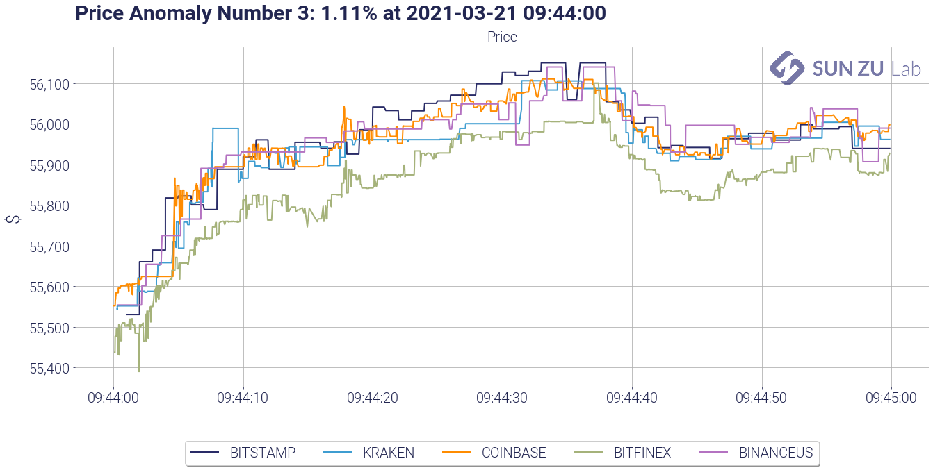
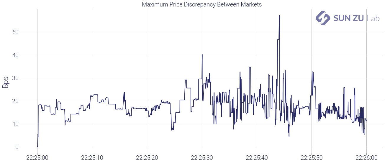
For the sake of curiosity, below are two more anomalies abstracted from our report. The reader will find the Bitfinex discount again, and long, recurring inter-venue price discrepancies. NB: the last anomaly is one detected through our volume filters, hence labeled “volume anomaly”. Volumes on Bitfinex appear as extreme outliers, accompanied by price dips that have a very small impact on other venues.
Price anomaly #2: +1.11% on 3/21/21 between 09:44 and 09:45 UTC
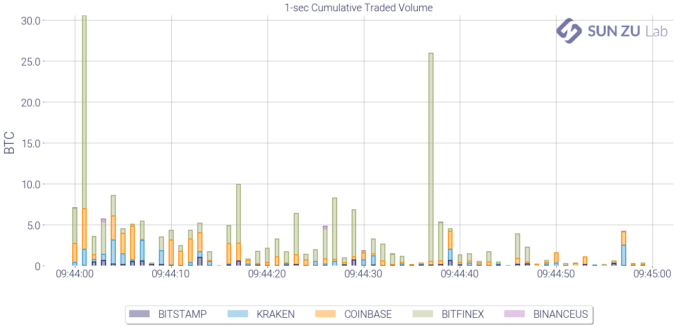
Volume anomaly #1: 706 BTC on 3/21/24 between 22:15 and 22:16

Well, we knew digital asset venues were not so closely integrated, but here we have a very detailed view of anomalies that are curious and result in significant price discrepancies. To track some of those anomalies regularly, we will produce a weekly report incorporating the above results (and more!) for BTC as well as other digital assets. Investors seriously curious about cryptocurrencies and digital assets may find in those a way to monitor market efficiency and as it evolves through time and across trading venues.
If you want to follow our research and efforts to shed light on all things related to the liquidity of digital assets, register for a 30-day free trial on our research, consult our website, or contact us. Feedback and comments are always welcome!
Our take on the liquidity of digital assets
A more systematic approach to liquidity monitoring
We at SUN ZU Lab have a deep curiosity about digital assets. Like everyone else, we follow bitcoin’s saga, with a volatility which, after all, is probably regarded more as a source or opportunity than a risk to be curtailed.
As we have written before (here and here), if digital assets were to constitute only a new source of liquidity, they would be an invaluable development in modern finance. Whoever has spent time on capital markets knows that liquidity is an elusive target at best. After decades of electronic trading, intense innovation, and regulatory adjustments, attracting and retaining liquidity remains as difficult as ever. Exchanges and trading venues worldwide know it firsthand, their primary responsibility is indeed to attract liquidity, one way or the other. Many have adopted “market-making” schemes whereby they basically waive fees and sometimes actually pay for participants to contribute orders in their central order book.
Liquidity is defined as the ability to rapidly buy and sell a product for significant size without adverse impact on its price. Note that this definition is not limited to financial products. Real estate for example is a very illiquid asset class. There is a constant trade-off between the time it takes to conclude a transaction and price improvements each party is willing to concede.
Liquidity is a very desirable feature on any developing market, and digital assets are no exception. If the price of bitcoin catches the front news almost every day now, reported trading volumes are also a big part of the story. Taken at face value, those suggest that bitcoin is at least as liquid as some of the most heavily traded traditional instruments (see here and here for a more detailed analysis on the subject).
Even though this is most certainly not true, in great part because volumes are massively manipulated (an x10 factor is commonly hypothesized), the bottom line is that public attention for bitcoin and more generally digital assets is bound to translate into more and more trading activity i.e. more liquidity. In fact, most of it may not even be visible: as investors stand by for the right price to buy or sell, they do not necessarily register their interest with a broker or on the order book of an exchange.
Where is liquidity to be found? There are dozens of venues, on-chain, off-chain, centralized, decentralized. Which venue should you turn to to find the most liquid market? Should you trade on several markets, if so which ones? What price and/or size can you expect if you include 1, 5, 15 markets in your shopping list?
Those are fundamental questions for investors, retail and professional alike. The marketplace is evolving so quickly and in so many different places that it is virtually impossible to follow all relevant developments. That’s where we at SUN ZU Lab, want to help. We started out with a mission: promote a truly institutional standard in the analysis of digital asset liquidity. Our quantitative research is meant to offer a dissected view of liquidity in time and space, so interested parties can get a sense of macro and micro trends to make better-informed decisions for their trading flow.
We had to start somewhere, so we decided to launch our product on BTC, including for the time being 3 markets: Coinbase, Kraken, and Bitstamp. We will be producing 3 reports: one on liquidity, another one will look at market integration (i.e. the existence of price discrepancies between different venues), and the third at what we call market anomalies (i.e. events for which price or volume is an outlier). [Register for our newsletter if you want to hear from us and receive a free sample!]
Let’s look here at the liquidity report. It is a quantitative dissection at liquidity over a 2 week period and will be produced twice a month. Our intention is to present rigorous information to qualify and quantify liquidity dynamics both intraday and over the observed period.
Here is the list of indicators we look at, abstracted from the report over the last 2 weeks in January:
- price and volume-at-price:
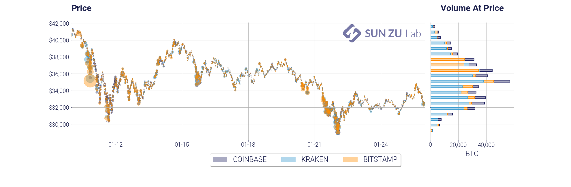
This chart is a necessary introduction, we absolutely need to have a sense of how the market has moved over the period, and at what price points have traders concentrated their activity. The volume-at-price add-on on the right side is an elegant way to present this information.
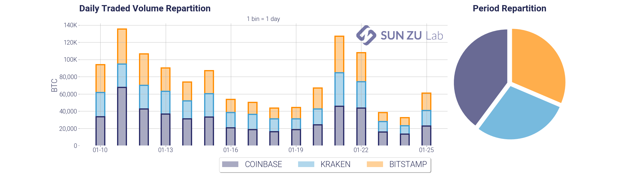
- traded volume, overall and by venue (daily and intraday):
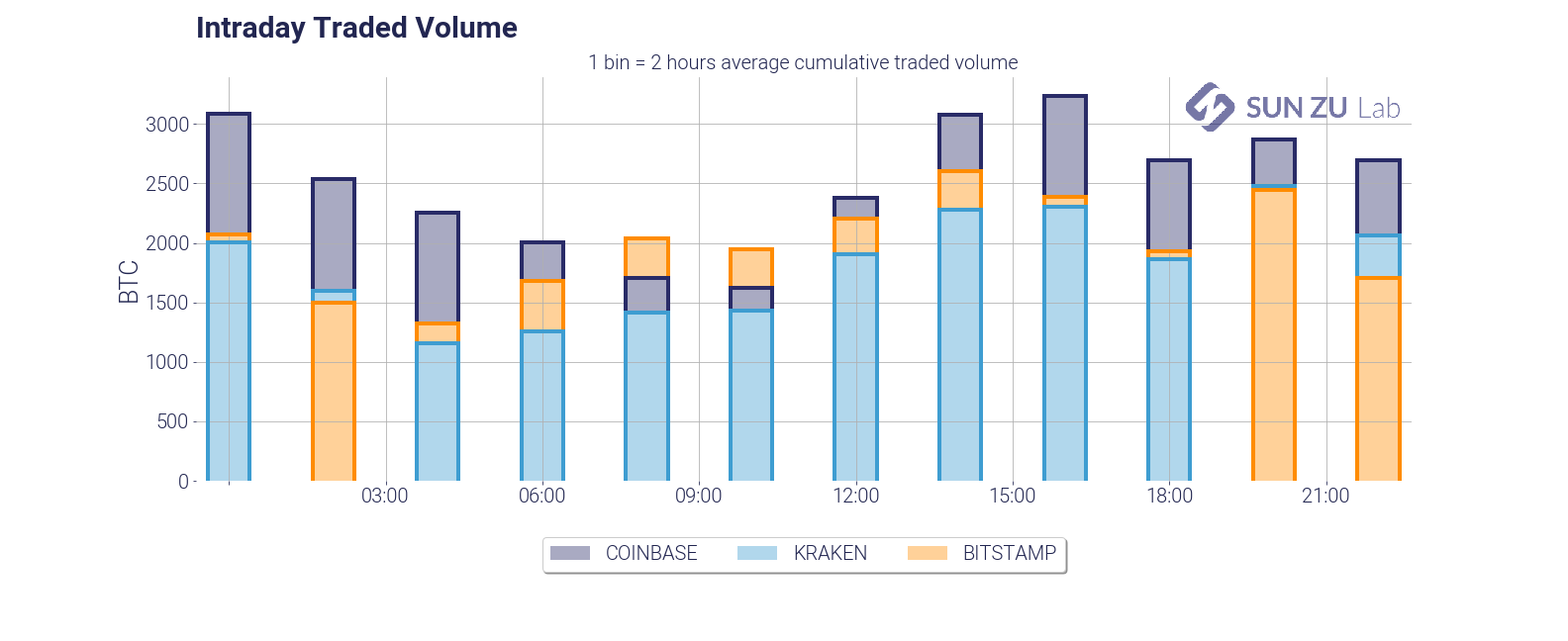
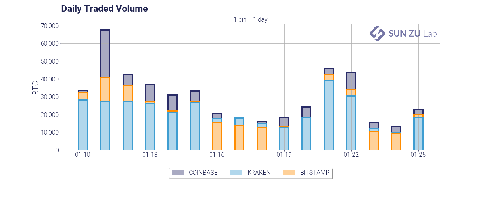
Those two charts are fairly standard representations of volumes. We present both views to determine whether there are intraday patterns that have developed over the observed window. In particular, we could expect higher volumes when Asian and/or US markets open. Quite naturally we need to address also the question of the relative partition between exchanges:
- daily and intraday annualized volatility:
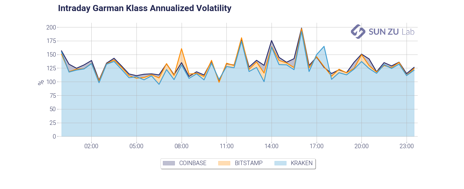
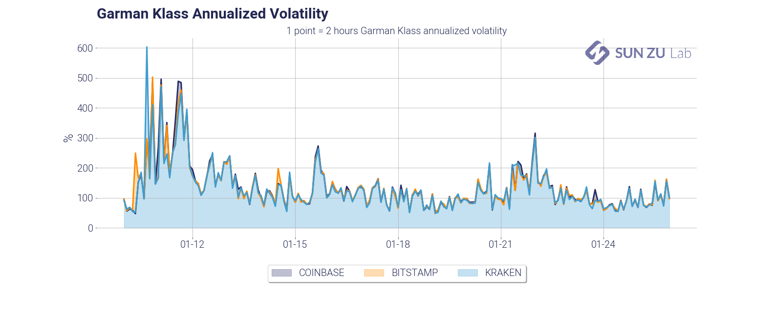
Similarly to volumes, we plot both the intraday and daily volatility to monitor whether intraday patterns developed. Despite the fact that the charts are very similar on distinct venues, we decided to keep them all, to make anomalies between markets stand out, should some come up.
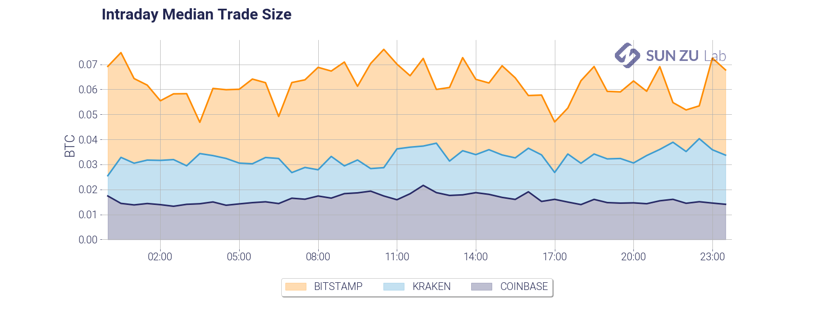
- mean and median trade size (daily and intraday):
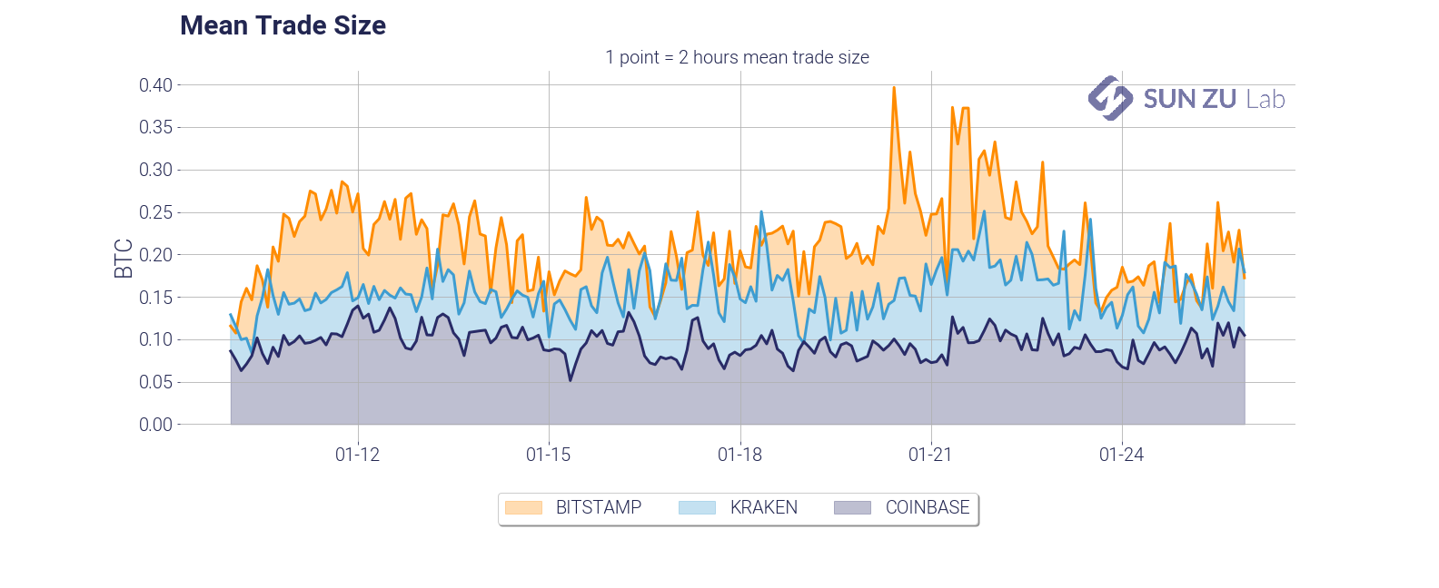
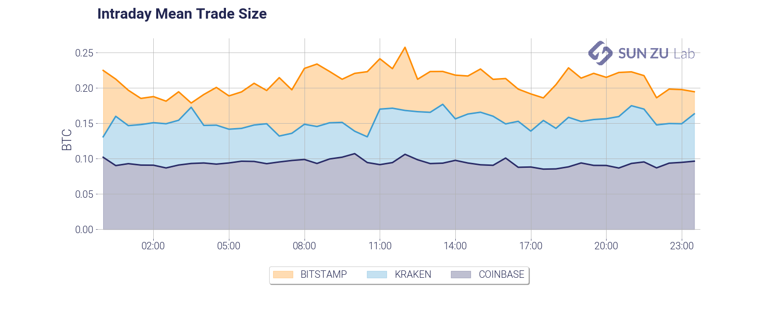
The average trade size is a very important feature of liquidity dynamics. It is dependant on a number of factors, such as the type of investors (retail, institutional), the pricing structure of the exchange (fixed vs. variable fees, caps on per-order fees), time of day, etc. We found in our research that infrequent large trades tend to alter the readability of the average, therefore we decided to include the median as well:

Believe it or not, we think there are many more questions that we should be asking. For example: how does trade size vary with volatility? with the bid-ask spread? We will absolutely incorporate the relevant metrics to answer those questions in due course.
- daily $10M and intraday $100K participation:
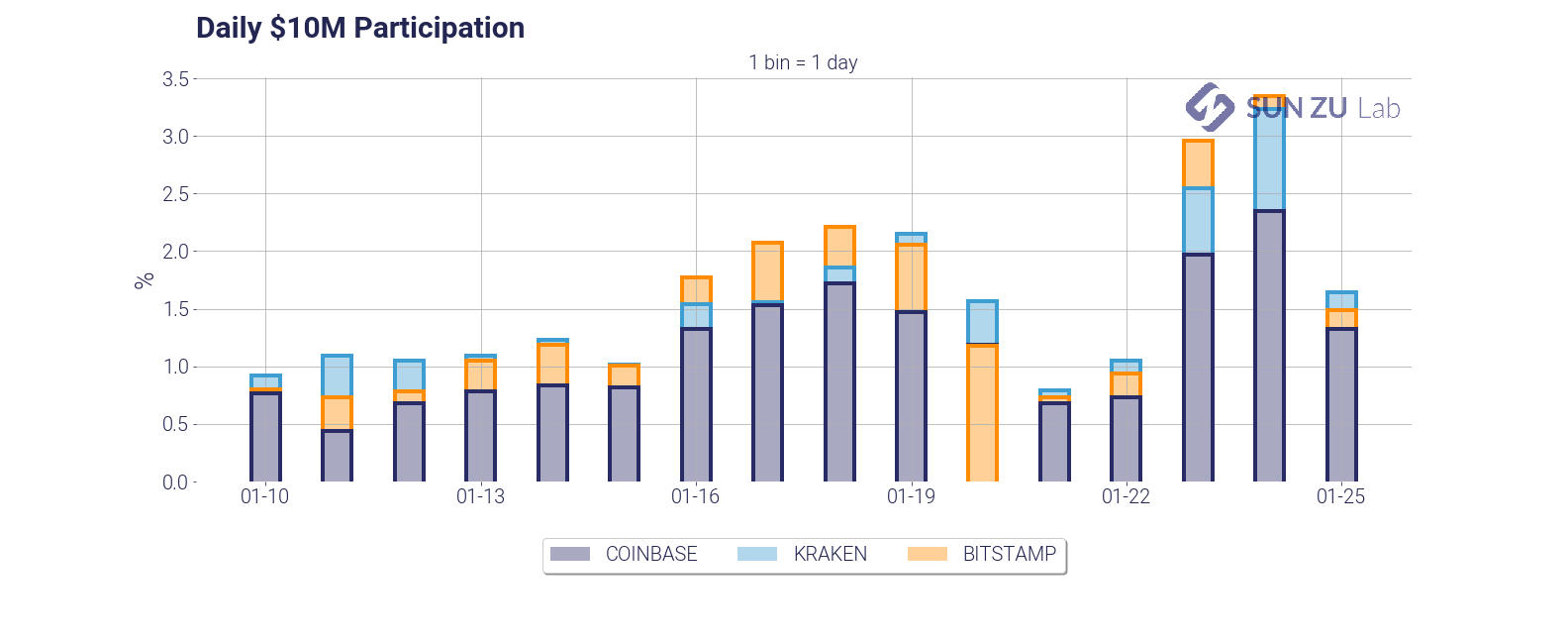
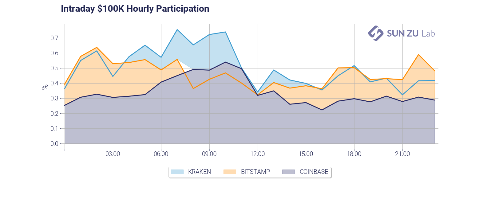
Those two charts give two measures of market participation. First, we answer the question: how much volume does it take on a given day to fill a $10M order? As you can see it takes anywhere from 1% to 3% of the daily volume, on each exchange taken independently. Practitioners in traditional markets advise their clients to never cross the 15%~20% threshold. In the case of BTC on those three exchanges, roughly 10 investors with a significant order would be enough to “drain” available liquidity. The second chart is an examination of the same question, with a shorter time frame (1 hour), and a smaller size ($100K). Markets seem to be amply capable of absorbing repeated $100K orders.
- intraday market impact of a $100K order:
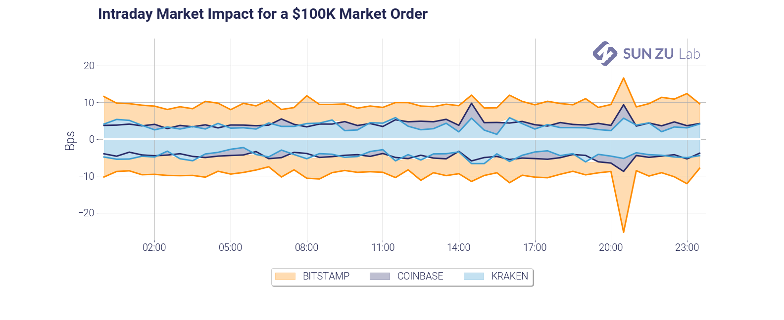
This chart is a slightly different take on market impact. It answers a different question: how much adverse price movement would a $100K market order create? This gives a measure of market depth, which as you can see is fairly stable in time but quite different across venues.
- intraday ratio between traded and available volume:
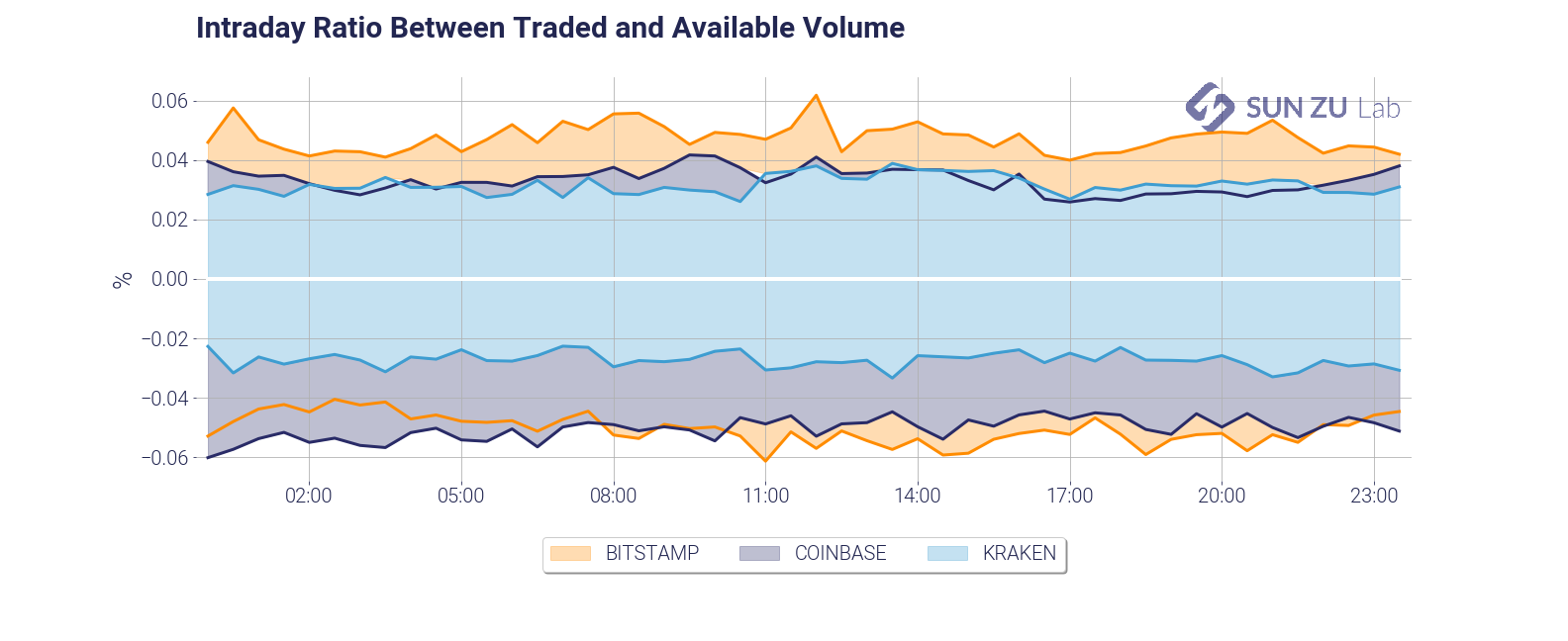
By definition, each trade “consumes” part of the visible liquidity. What ratio of the liquidity available is consumed, and how fast is it replenished? The chart gives an answer intraday. As can be seen, there seems to be a somewhat constant rate of consumption and replenishment, something which is somewhat surprising. Again, we will absolutely look at this in deeper detail in due course.
- volume at best limits (daily):
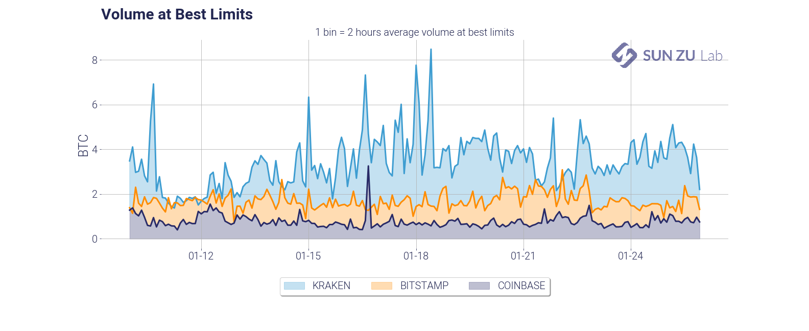
This chart presents a view of the total size available at best limits, in each of the individual order books. It is useful to monitor absolute levels of “aggressiveness” from market participants, and patterns in the overall migration, if any, from one venue to the next.
- intraday mean price difference and mean time between subsequent transactions:
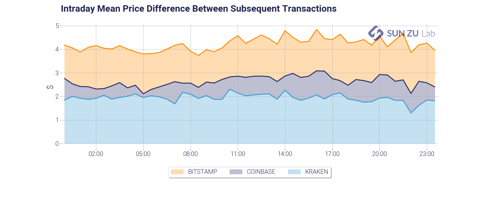
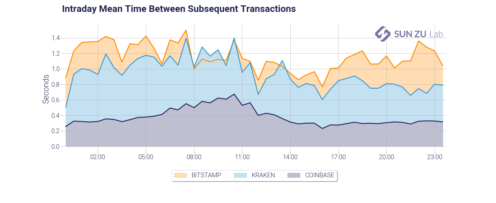
Those two charts present an introduction to order book velocity. Each venue has its core client base, and those may have very different trading habits. Those habits are also constrained by venue-specific factors such as commissions, API throughput, matching engine performance, etc. Investors may gain valuable insights by qualifying each venue’s reactiveness and specific velocity.
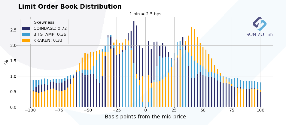
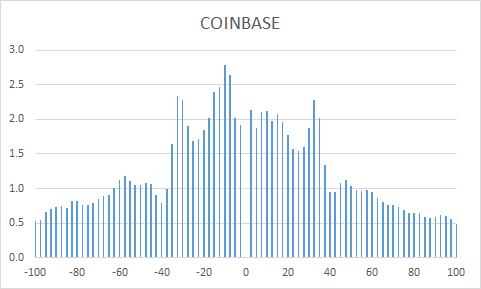
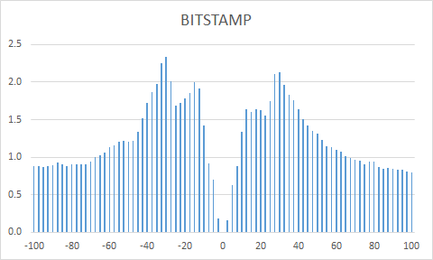
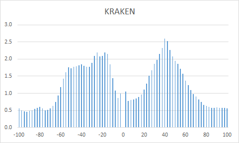
- limit order book distribution at +/- 100 bps and +/- 400 bps from mid-price:
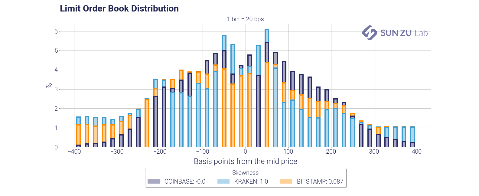
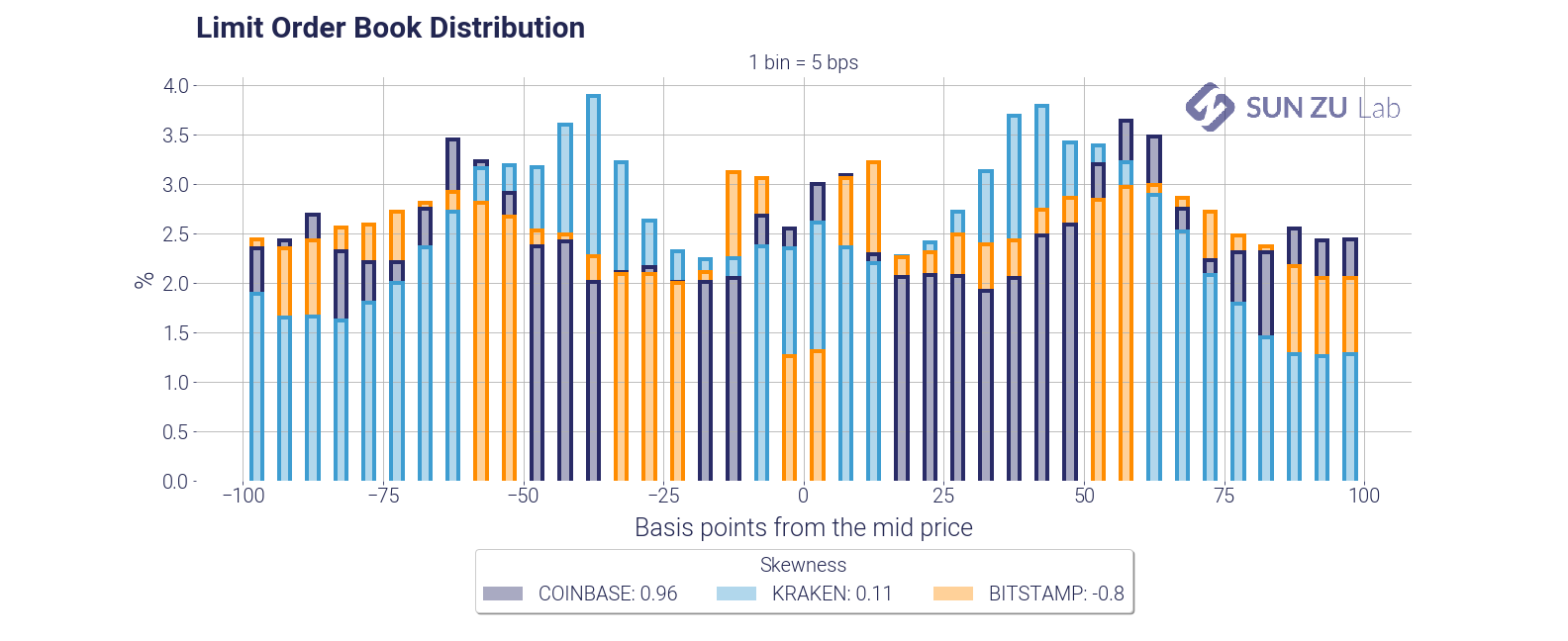
Those charts present the distribution of each order book around mid-price, for a depth of 100 bps and 400 bps. There is a wealth of information to be extracted from those distributions. Here are two examples.
First, they indicate how participants think about risk beyond the first limits: are they placing a lot of orders away from mid? if so, are those significant compared to the best limits?
Second, how does each venue compare? Am I more likely to find liquidity at 50 bps from mid on Coinbase or Kraken? What about 100 bps?
Market makers, speculators, institutional investors have very different trading strategies. Market makers may be interested in price discrepancies, which would lead them to participate symmetrically from mid-price. Institutions may be more buyers or sellers at different times. In each case, they would presumably occupy one side more than the other. Although the averaging in the above charts provides a lot in readability, it is also the source of much “compression”. We have a lot more to say on order book dynamics, and in fact, it will be the subject of an entirely new report soon!
- limit order book imbalance:
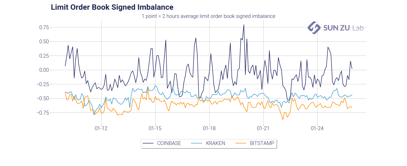
Popular wisdom would have that a trending market shows asymmetry in liquidity. Well, unfortunately, this is not quite as simple as that. The graph above represents the order book imbalance by trading venue. Order book imbalance is defined as (Qa — Qb)/(Qa + Qb), where Qa is the total quantity, available at 100 bps from mid on the offer, and Qb is the total quantity available at 100 bps from mid on the bid.
Imbalance oscillates between -1 and +1: a market with no bid (Qb = 0) has an imbalance of +1, and -1 for a market with no offer (Qa = 0). An imbalance close to 1 means the order book is dominated by offers and vice-versa.
It is very apparent that the three exchanges have very different imbalances. At 100 bps market depth, Coinbase is mostly an “offer” market (with variability), whereas Kraken and Bitstamp are mostly “bid”.
- average market depth:


Total visible liquidity is a very natural question: how many bitcoins are available in each order book? Those two charts present two different answers to that question. On the left, absolute size at 100 bps, on the right intraday depth at 10bps. Those can help provide first-order estimates of impact: 100 BTC can be executed with a max impact of 50 bps; at any time, an order of 10 BTC should not be filled more than 10~15 bps from mid.
- spread and weighted spread distribution:
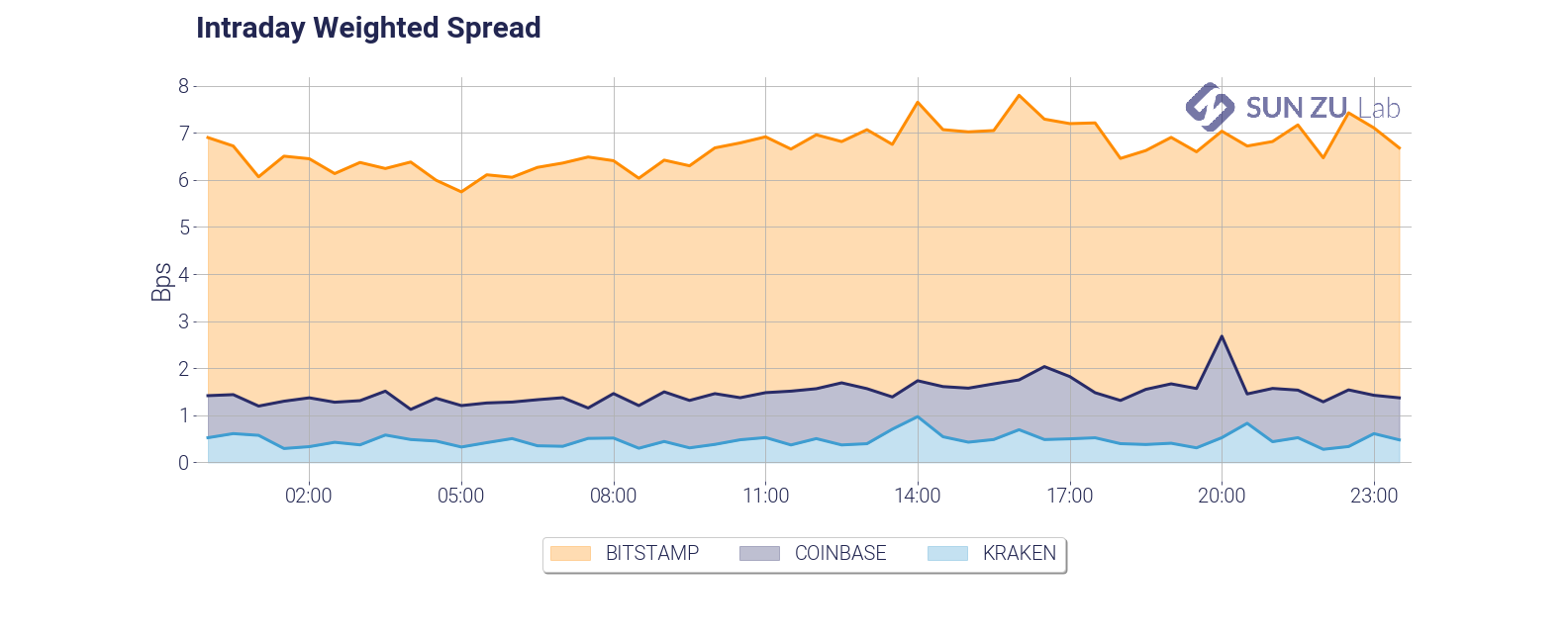
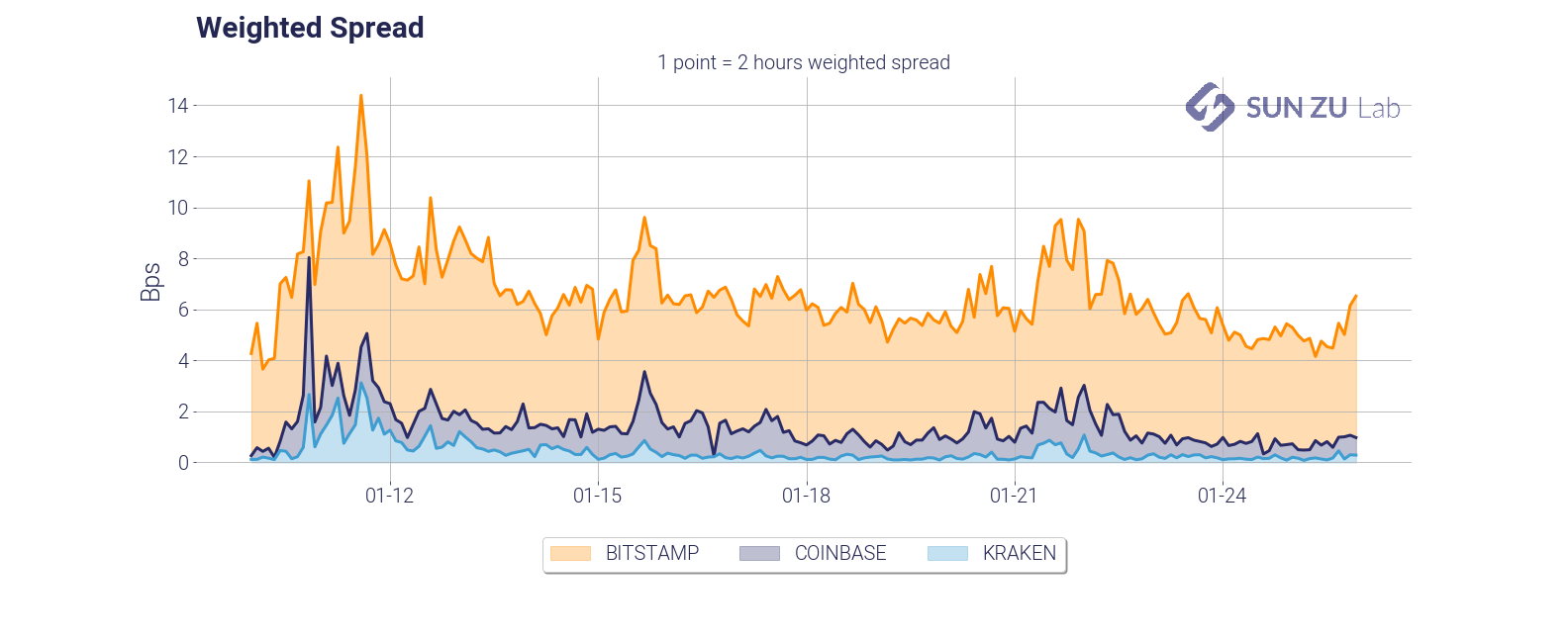
Of course, no study of liquidity would be complete without spread analysis. Above are time series of the weighted spread, showing intraday and daily dynamics. Unsurprisingly the weighted spread deteriorates quickly with volatility (early days in the chart). The charts below enable comparison between a simple spread and a measure weighted by the total quantity on best limits (bid + offer):
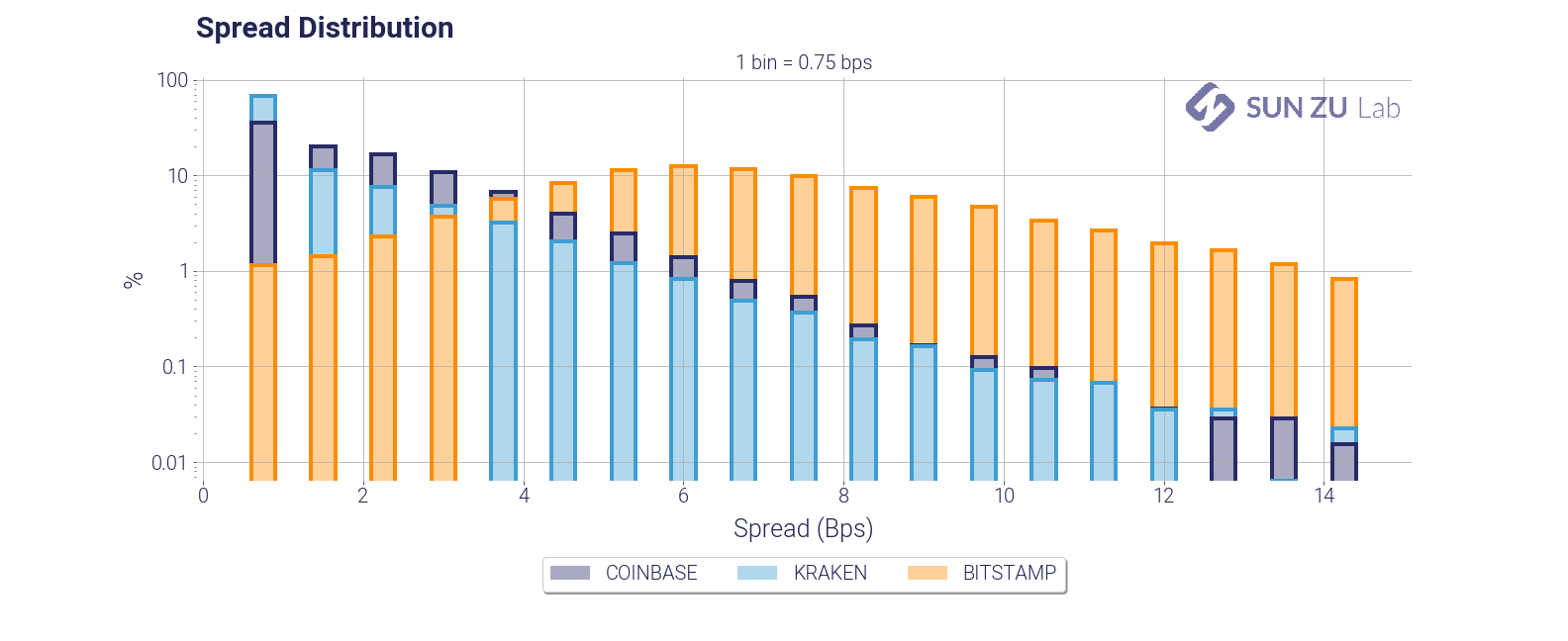
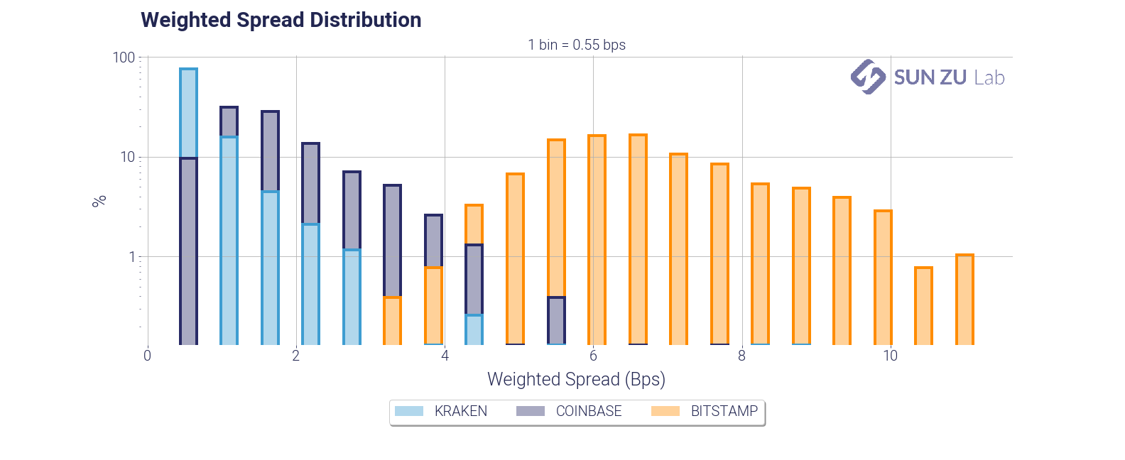
It can be seen quite easily that exchanges have very different order books.
Now this is a long list of charts and tables. You may get a sense that a lot of it is repetitive. We would argue that it is not, quite the contrary. As was said earlier liquidity is an elusive parameter, and in the world of digital assets it is bound to evolve very quickly. Monitoring and understanding it appears to us an important prerequisite for traders already active in the space, or even for “crypto curious” i.e. investors or institutions interested in the subject but not yet in a position to transact.
Is Bitcoin a safe haven in times of crisis?

Background
Bitcoin and digital assets in general have been presented by some as credible alternatives to institutional finance as we know it today, with its strengths and especially its weaknesses — widely exposed and documented with the 2008 crisis. The idea of a mechanized trusted third party has a certain appeal. Removing human arbitrariness and intermediaries in the management of money would make it possible to get rid of what is perceived as cumbersome state control and to guard against the stranglehold of the financial industry, which is accused of taking a large share of profits and caring far too little about consequences. Gone are the days of lax inflationary policies steered by a central bank subservient to political power. Not to mention the possibility of keeping one’s savings right under the nose of bankers and tax officials.
There is much to be said for a world in which dehumanized algorithms, complete anonymity and decentralized governance have become the norm, a world that is unlikely to deliver on the promises its proponents put forth, both in terms of efficiency and equity — not to mention questionable transparency, which is high on the list of criticisms from institutions today. But some proposals are worthy of attention and, at the very least, of consideration. One of them is the following: are digital assets likely to offer true storage of value, independent and uncorrelated to traditionally available assets (shares, bonds, gold, etc.)? The example of countries with failing institutions is often cited, such as Venezuela or Nigeria. Bitcoin would be a way to hedge against immediate monetary turbulence, delirious black market exchange rates etc. With the coronavirus crisis, this question extends to developed economies: would it be in the interest of an individual or institutional investor to transfer part of his savings to bitcoin in anticipation of a collapse of traditional assets or even the financial system as a whole?
Let’s eliminate immediately the hypothesis of the collapse of the system: if such a catastrophe were to occur, the consequences would be sufficiently devastating to take with them the very existence of a “safe haven”, a compartment protected from the ambient deflagration. Instead, we will try to answer the question of the allocation between digital currencies and traditional financial assets.
Examining this idea requires some work, which we will carry out in a very basic way. The question can be rephrased as follows: “if I had chosen to invest part of my assets in certain digital assets, would I have done better than traditional markets? ». We consider this problem through the examination of three elements: the performance of digital assets, their volatility and their liquidity.
Performance is used to determine whether or not an investor would have avoided a decline or even benefited from a rise if he had “pivoted” to a digital asset. Volatility gives an idea of the carry of a position, i.e. its variation over time: is it really a smooth ride? Liquidity is a slightly more technical notion: when the market panics, is it still possible to carry out transactions or, on the contrary, does everyone run away?
A word on the notion of “safe haven”. This concept captures the idea that there are assets — financial or otherwise — that provide safety in the event of financial turbulence. The perception of security can be linked to objective or subjective criteria. When investors bought US and German debt in the sovereign crisis of 2012–2013, the perception of security was linked to an objective factor, the economic resilience of those economies and the very high probability that governments would be able to meet their commitments. Conversely, the status of gold as a safe haven has no basis in reality today. When world currencies were pegged to gold in the Bretton Woods world, gold was the ultimate security since it was the assurance of being able to buy any currency at a fixed price. In the modern world, where exchange rates are floating, possession of gold does not provide any real safety. We are in the realm of self-fulfilling prophecies. Everybody thinks that gold resists better when the markets fall, so investors buy it as soon as tensions appear, and bingo we see a posteriori that the predictions have proved to be correct. Another important point is that the use of safe haven assets is limited in time. Nobody takes a position on gold to protect a portfolio over 15 years. Anyone who is significantly invested in gold for 15 years does so to diversify their risk in an allocation strategy, not to protect themselves from volatile periods. A safe haven plays a role episodically, mainly when the markets are nervous. It is therefore at this time that one must look closely, and this is why the recent crisis offers a particularly relevant point of observation.
A quick methodological note: the S&P 500 is modelled by its most liquid exchange-traded fund (ETF), known as the Spider (ticker SPY, $257 billion in assets as of 4/24/20) Gold is modelled by the sum of the two largest physical ETFs (tickers GLD and IAU, $80 billion in assets). US government bonds are modelled by the iShares 7Y-10Y ETF (ticker IEF, “only” $21.5 billion in assets). The BTC/USD and ETH/USD data are from coinmarketcap.com, volumes were divided by 10 to account for the numerous and documented manipulations of various exchanges on their data. The factor 10 is arbitrary but regularly appears as a working hypothesis in studies on the issue (but in fact the absolute value of the volume is of little importance here). The prices are the closing prices, and of course all execution issues are neglected. Access considerations are also neglected: the products used here are easy to access, anyone can open a securities account with an online broker within a few days. Access to digital assets is not yet so democratized. All this is therefore very simplified.
Performance
The performance we are interested in is the one surrounding the recent crisis. An investor who has been carrying bitcoin or ether for a long time is doing so for reasons that are not our concern here. Here is the relative performance of the 5 assets between 01/23/20 and 4/22/20:
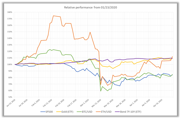
The charts speak for themselves: the crisis reached its climax on March 12th, after the US President announced, quite unexpectedly and without any consultation, the closure of US borders. All assets drop sharply, except bonds, which have always been considered safe among the safest. Surprisingly, gold is also falling significantly. It appears that bitcoin or ether would not really have been an insurance policy. The BTC holds better over the few days before the crash, but drops lower immediately afterwards.
Another way to answer the same question is to ask what was the “safety premium” for investors who made the right choice? Prior to March 12th, investors were given a free hand to choose the best investment if they sensed upcoming turbulence. This behavior, called “flight to quality”, is widespread. Before mid-March the pandemic was beginning to show its effects in China, nervousness about the impact and spread of the disease was beginning to show. A prudent investor could have chosen to transfer some of his positions to assets considered safer, such as gold or US sovereign bonds. The outcome would have proved him right… The following graph shows the premium he would have captured:
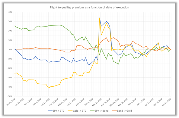
Precisely, the green curve reads as follows: an investor who would have transferred his position on 01/23/20 from the S&P 500 to US bonds would have captured a 25% gain between 01/23/20 and 04/22/20 (compared to a situation where he would have remained invested in the original support). In concrete terms, he would have avoided the massive decline around March 12th. If he had taken this decision later, at the end of February or the beginning of March, he would still have gained 10%. The graphs show the exact premium captured for having changed support, depending on the date the change takes place.
It appears that the choice to pivot from S&P 500 towards BTC (blue curve) only pays off on March 12th, when the BTC loses 37%. Pivoting from gold to the BTC would have been even worse off (yellow curve).
Note that after the crash, the decision to stay invested in the original support or to pivot is of little importance: from about March 26/27th, the curves are rather undifferentiated. Moreover, the bond > gold pivot (orange curve) turns out to be winning at almost any time…
Volatility
To examine volatility, we could use the financial version, i.e. the annualized standard deviation. But for a change we will use a more intuitive measure, the intra-day variation. The following graph shows the 90-day moving average of the daily high-low amplitudes of the 5 assets:
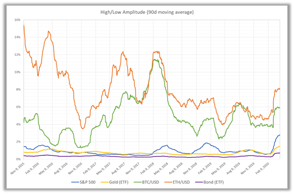
NB: the starting date is arbitrary, it was chosen to visualize about 5 years of data.
This is an intuitive rather than a financial measure of price variability, which can be understood as follows: since May 2018, on a “normal” day, the BTC has varied on average by 4% to 8% between its highest and lowest price. In contrast, the S&P 500, gold and bonds only vary between 1% and 2% (or even less). In March, we see a significant increase in these figures, which corresponds to higher intra-day volatility, i.e. the effect we want to measure.
Indeed, carrying a BTC or ETH position is not a smoot ride compared to other asset classes: the amplitude of movements is 4 to 5 times greater. Incidentally, dealing in BTC requires careful monitoring compared to traditional assets that have the good taste of moving less quickly and whose markets are closed several hours a day.
Liquidity
Finally, let’s look at liquidity, characterized by daily volumes. This is an ex post measure of liquidity, precisely that which has been expressed in the form of transactions. We could also look at an a priori measure, the liquidity available before execution in the order books of exchanges, but that is a more complex task…for another time. The graphs below show average trading volumes (90-day moving average) over a period of about 5 years, with 1-month volatility as the second axis:
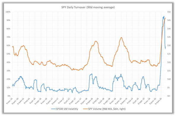
The S&P 500 ETF is one of the most liquid instruments in the world, with $20 to $30 billion traded daily. The causal relationship between volatility and volume is immediately visible. Same presentation for gold:
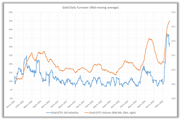
The ETFs under consideration only trade around $1 billion a day, but the causal relationship is still perfectly visible. NB: the volatility seems much more uneven than that of the S&P 500, but this is an optical effect related to the smaller scale.
Here is finally the same graph for the BTC:
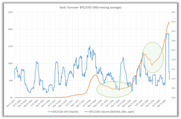
If we had to (re)confirm the much more volatile behavior of the BTC, here it is: volatility episodes are frequent, acute and independent of those of traditional markets. But this graph raises many questions.
Compared to previous ones, it immediately appears that volatility/volume causality breaks down. Some peaks in volatility are not accompanied by any increase in volume, and conversely the volume seems to grow by itself…
The two areas circled on the graph are anomalies, presumably explicable by the fact that the officially announced volumes are vastly overestimated and that the magnitude of the “ghost” volumes varies over time. Both the S&P 500 and gold (and the bond ETF, not included here) show a fairly stable “structural” liquidity: when volatility eases, the average volume falls back to a floor. The fact that it falls very sharply on BTC between May 2018 and March 2019 suggests that the “true” floor is much lower. Similarly, in the second half of 2019, volumes return to average levels for the S&P 500 and gold. Nothing comparable for BTC (or ether), growth is exponential. It is not justified by any measure of volatility, nor by any other market event or media coverage.
Conclusion
To the question “Is BTC a credible alternative to the volatility of traditional markets?” it is fairly easy to offer a negative for the recent crisis. It is certainly an isolated point — but absolutely significant in view of the magnitude of the crisis. There is no doubt that gold and sovereign bonds are still the “safe havens” they have long been. On the other hand, the liquidity of bitcoin (and ether) is still problematic, and does not exhibit an explainable pattern in view of the proven behavior of the investment community as expressed every day elsewhere.
Liquidity and order book distribution

When we formed the team to launch SUN ZU Lab, we had mostly one question: how liquid are crypto-assets, and if there is indeed liquidity to be found, to what extent is it different in quantity or quality from what we have seen in traditional markets for 25 years?
“Liquidity is defined as the ability to buy or sell an asset for large size without significant adverse price movement.”
This straightforward question is not so simple and has many ramifications. Indeed if you can qualify and quantify liquidity, then you should be able to execute better (i.e. with smaller adverse price movement). Therefore whoever starts with order book analysis should be ready to go all the way to real-time “smart” order routing.
We are not the ones at SUN ZU to shy away from a challenge like this, so we decided to take the first step and share our results regularly. Among the many insights we will explore and comment, we would like to start with a fundamental element: order book distribution.
The chart below shows how liquidity aggregates (those are excerpts from our first public research report available here) around mid-price. To get a sense of this, we plotted the distribution of orders in the BTC/USD order book for three exchanges (Coinbase, Bitstamp, and Kraken) and averaged the results for the first half of September:
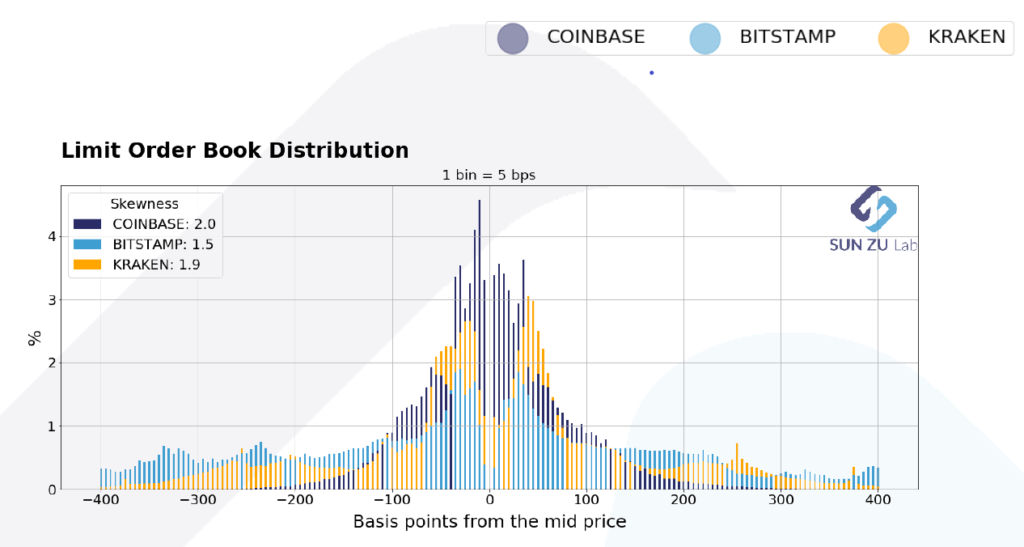
Order book distribution at +/- 400 bps from mid-price. Data from Kaiko.com.
This chart reads as follows: each bar represents the proportion (in %) of orders found at the given distance from mid-price (mid = (bid + ask) / 2). for example a 0.7% bar at -150 bps indicates that 0.7% of all orders in the price interval [-4%; +4%] can be found 1.5% below the mid-price. By construction, for each exchange, the sum of all bars equals 100%.
In fact, the above chart is the superposition of three individual pictures:
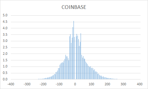
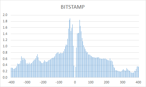
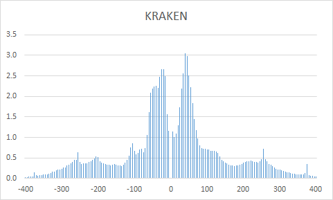
The benefit of layering the three graphs is to present an aggregate view of liquidity, and its partition across the three exchanges, with a single scale and a clear color-coding.
If we focus on a smaller interval, say [-1%; 1%], we get the following distribution:
Order book distribution at +/- 100 bps from mid-price. Data from Kaiko.com.
As before, this image is the results of layering three individual charts:
What’s the point of those charts? Why did we choose to aggregate data across exchanges and average through time? Well, the intent is to measure behavioral patterns from investors, on individual exchanges, and across the entire market (represented here by only three exchanges, more are coming). Here are a few points of interest:
- bell-shape curve: does a bell-shape curve make sense? Yes indeed: it is quite intuitive that the density of orders decreases away from the place where the action is taking place i.e. the mid-price. Yet differences are quite obvious when approaching mid-price: in some cases the available size in the book increases, in other cases it decreases. For example, the spread is much narrower on Coinbase than on Bitstamp or Kraken, it almost looks as if investors on Bitstmap wanted to stay away from the first limits in the book. Indeed, we intend to put much more work investigating those questions to deliver qualitative and quantitative insights that can help investors better understand and execute their transactions.
- speed of decay: is there information to be extracted from the speed at which liquidity decays? Absolutely: in a world of high volatility, many investors will want to place orders far away from trading levels to benefit from violent moves. This type of strategy is common in statistical arbitrage, it would be a surprise not to see something similar emerging in crypto-land. The “fatness” of the tails also serves as an indicator of “latent” liquidity i.e. orders waiting to be filled under proper circumstances.
- symmetry: is there a fundamental reason why those distributions should be symmetrical? Well, yes and no. Market makers tend to be symmetrical in the way they place orders. There is little sense in providing liquidity on one side and not the other (if you happen to have a commitment to provide liquidity you don’t have a choice in fact). Native buyers or sellers will on the contrary place themselves on one side or the other. Their relative proportion might therefore alter the symmetry of the order book. However, this relationship is severely weakened in a world where market manipulation is widespread: anybody can put massive orders for no other purpose than “window dressing” the book. Here again, more analysis is required to understand order-book dynamics.
- relative values between exchanges: exchanges have very different order books. Explanations for this can be diverse: fee structure, market-making schemes with specific obligations, more or less stringent market surveillance, minimum trading or maximum holding size, availability of leverage, etc. Because trading on a given exchange still requires fiat and crypto deposits and implies custody risk, comparing liquidity at different exchanges is quite important to choose a few in the many available.
- time-dependency: the data here is for the first half of September. SUN ZU Lab will produce those reports regularly, enabling comparison from one period to the next. If things change, for individual exchanges or on aggregate, it may indicate that liquidity is increasing, decreasing, or shifting places. Certainly something worth knowing.
- absolute vs. relative distribution: we have shown here relative distributions, i.e. no mention is made of the absolute size available in the respective order books. Also, we have looked at one asset only, BTC. Well, there’s only so much we can do here. Bear with us, we have much more to say on those subjects!!
Welcome to the wonderful world of liquidity analysis!